
This group branding project began with understanding the client, UGA Pride Center, and their need for a rebrand. Through an initial phase of client interviews, deep-cut research, and intergroup discussion. From there, we developed individual directions for the clients, focused on the main tenets of the brand personality through a developed manifesto. I focused on the tenet of Perspective as a visual narrative tool and framework for user experiences. After my initial direction was chosen, my group focused on clarifying the visuals, giving purpose to color choices, and incorporating client feedback to elaborate on the core concept. The final logo was made in collaboration with Jessica Shaklee and Elizabeth Harwood.
Initial Phase / First Client Presentation
Everyone coming to the Pride Center has a story and unique point of view. Because we understand everyone wants and needs something different from the center, perspective is vital to providing adequate support and service. This direction acknowledges the intersectional reality of everyone stepping on campus by translating depth and transparency into the design and brand feel. The energy is energetic and complex - just like the Pride Center.
Personal Contributions to Group Development
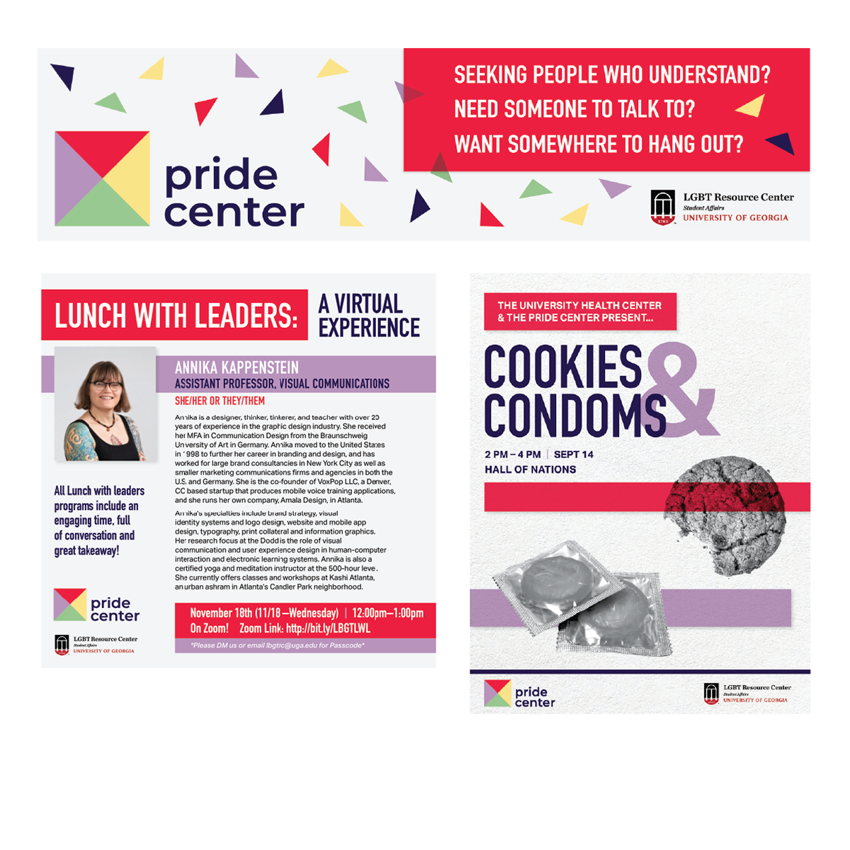
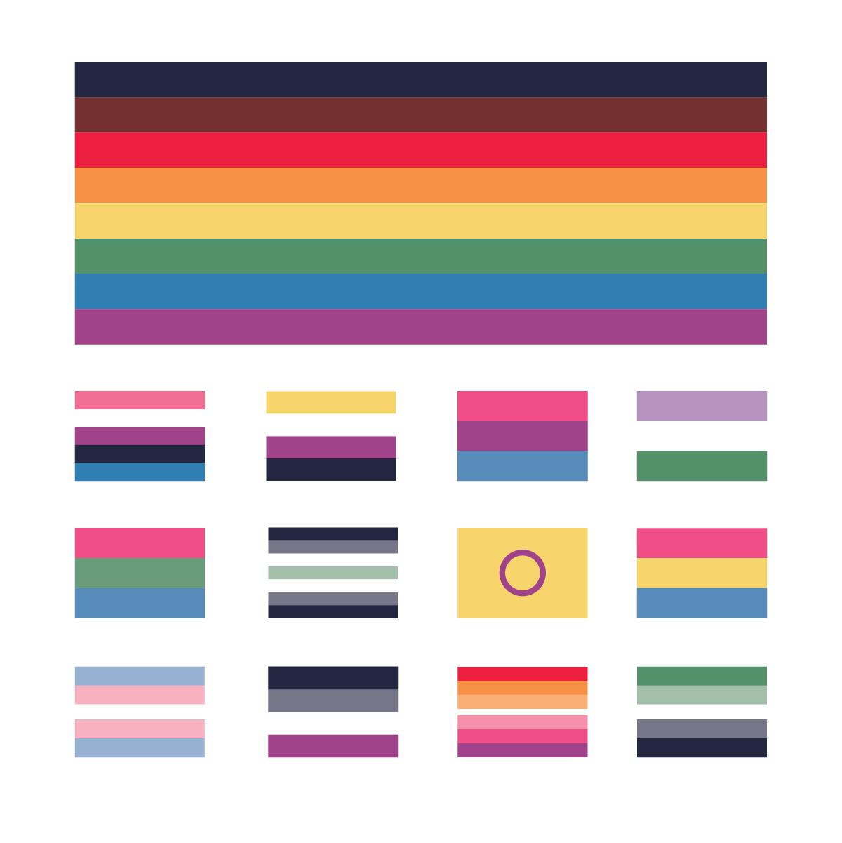
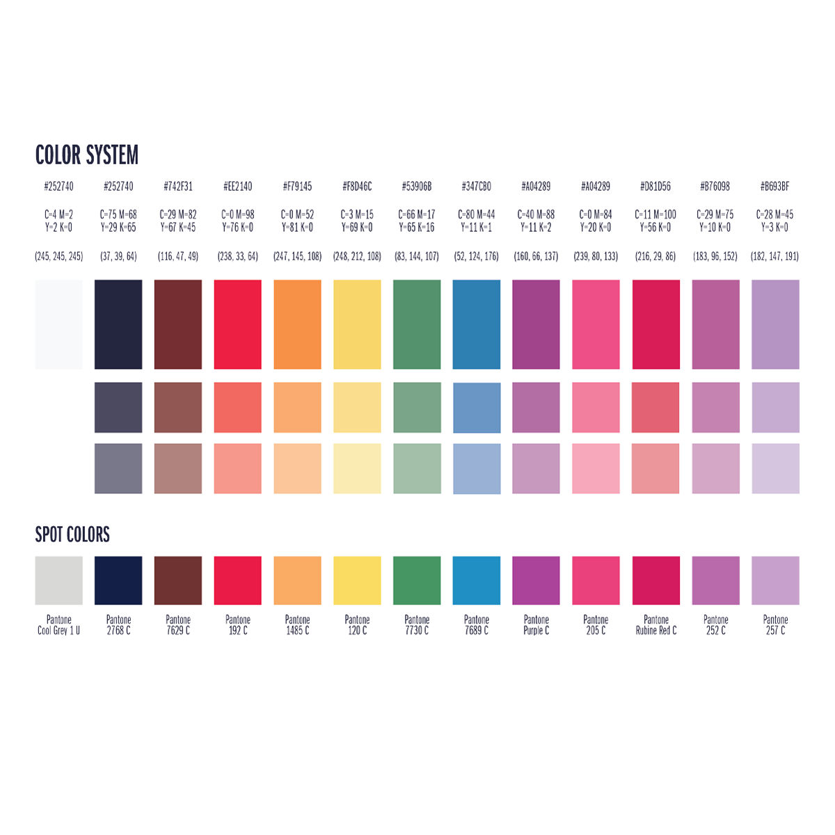
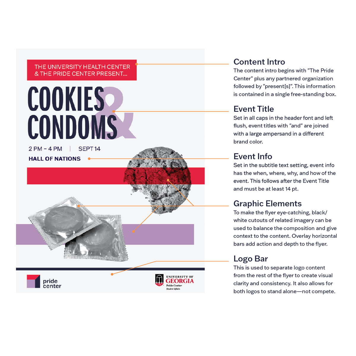
Using my "Cookies and Condoms" poster as a cornerstone of our Phase 2 development, my group honed in on the usage of red and lavender for their meaning in queer history and relevance to UGA students. Arising from the need for an inclusive flag system, this expanded color palette originated from the Philly Flag with tonal adjustments to complement our main brand colors. This system is intended for tasteful and restrained use. Its primary function is to provide a greater color range for social media posts or complementary materials that require colors beyond the main and secondary colors.
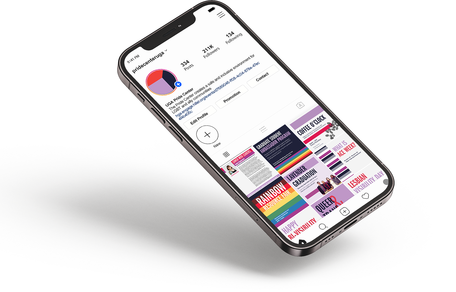
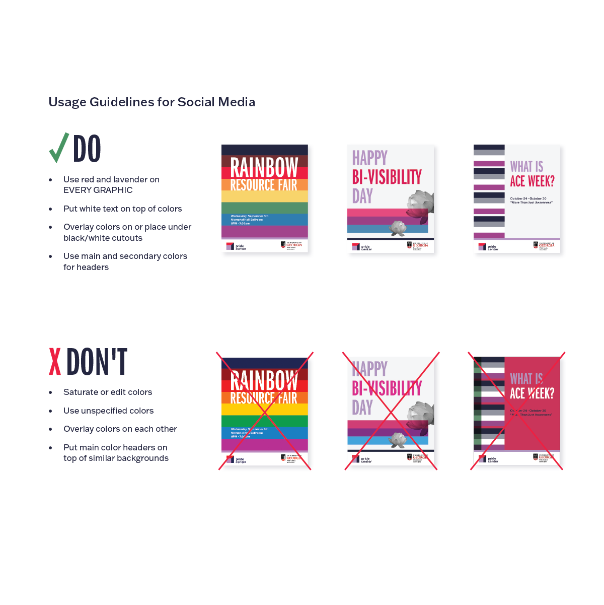
Poster and Social Media Guidelines
Usage guidelines for posters and social media are essential tools for the Pride Center brand, which relies primarily on these methods to reach target audiences.
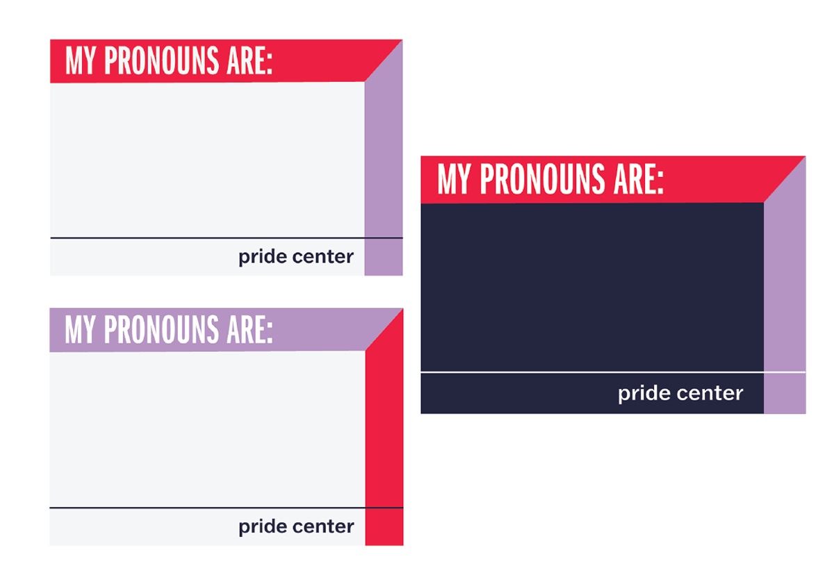
Pronoun Stickers
Pronouns can be fluid, interchangeable, or set in stone for some folks. This sticker honors the myriad of ways one can refer to themselves by allowing the user to write their pronouns. If those pronouns change, that person can come back to the Pride Center for a new sticker, generating traffic.